As part of Wembley 100, Uma Ghelani takes a look at how public transport was advertised to travelling football fans in the twenties and thirties, specifically ahead of FA Cup Finals…
The three London Underground posters below were designed by various artists during the inter-war years ahead of cup finals played at Wembley.
They show us how football fans attending the matches were encouraged to use the Underground and other public transport to make their way to the stadium.
Why is the specific context of the posters important?
After the First World War, modern posters began to transform London Underground stations almost into public art galleries. This time is even described as the golden age of London’s transport posters, with the stylistic qualities being that the posters were striking, bold, geometric and abstract. During these years, designing a poster for London Transport became an honour for both great and aspiring artists.
London Transport was regarded as a leading patron of the arts. The Chief Executive, Frank Pick, started a progressive approach to the posters in 1908, and continued to oversee the many commissions of the golden age. The posters were intended to be moving and impactful whilst keeping the subject clear —they wanted to push public taste via exposure to adventurous art in the everyday.
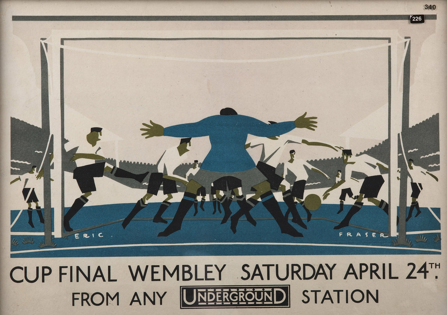
This first poster is from the fourth FA Cup Final to have been played at Wembley, and was designed by Eric Fraser. He was a well-renowned British designer best known for his illustrations for the Radio Times, as well as his many advertisement creations.
The poster depicts a football game from behind the goal, with players wearing white shirts trying to score, and the goalkeeper in blue manning the goal.
It was produced for the London Underground in 1926 and is a great example of the design characteristics that distinguished the golden age of London Transport posters.

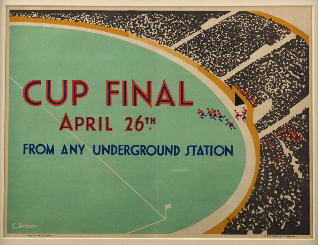
The second design by Charles Burton is from 1930. It shows us a view from the stands from where we can see the teams emerging from the tunnel. He designed posters for London Transport between 1930-34 and later worked as a commercial and industrial artist for shipping companies, railways and other national advertisers.
This design uses the least amount of words that it can, whilst still communicating the necessary information. It prioritises the composition and placement of the various elements, making it more likely to be seen and taken in as people pass by.
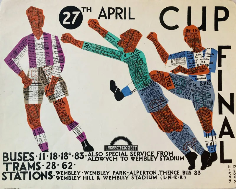
The third design is a poster from 1935 and was designed by Herry (Heather) Perry. She designed posters for London Transport between 1928-37. Here we see three stylised football players, made of underground tickets.
This one is interesting as it makes the link between the Underground and Wembley very clear through the use of the tickets to make the players, and the date of the final is written inside the ball. All the necessary information is communicated in a very innovative way.
What can the artworks reveal about football played at Wembley?
All three artworks emphasise the drama and the grandness of the final played at the special venue, and the high stakes of the game. Fraser’s framing packs in lots of players and action directly in front of the goal, with the goalkeeper making himself as big as possible, Perry’s shows a goalkeeper stretching as far as possible to make a save, and Burton’s uses scale and perspective.
The interesting designs of these Wembley posters added a bit of fun to everyday commuters’ journeys, whilst reminding them of the finals and how to get there. The journey to Wembley, both through teams playing matches and through fans physically travelling to the stadium, have always been an important part of what makes playing there so special. These posters are part of the history that celebrates the importance of the physical journey for the fans.